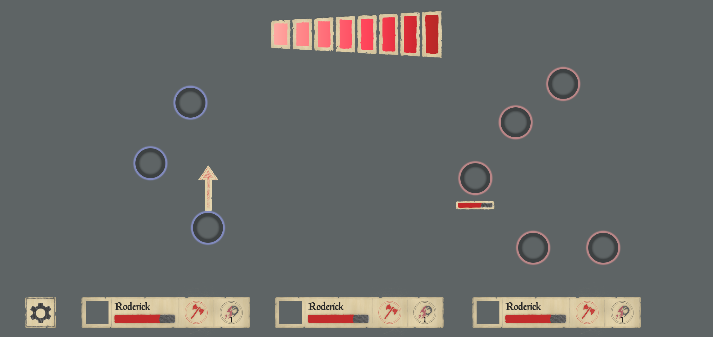
First attempt at a UI

After trialling the new mouse controls last blog and finding out they really didn’t work, I figured I’d put some effort into trying to create a UI that would allow the game to still be fun and also actually be controllable this time around.
The result of this is above. This is the first time I’ve tried to really design a UI and also the first time outside of a game jam I’ve created something for a game using the Surface Pro with stylus (instead of a mouse). Therefore, as this is mainly a learning exercise, I’ve created a torn-paper effect with hand-drawn items like cogs, icons, and healthbars.
The main change is that instead of having the aim and power settings be a single step I’ve broken them into two - first you drag from your character to set an angle. This causes the power bar to show in a fixed location. You then drag or tap the power bar to set the power of your hit. Dragging this all the way to the left-hand side will cancel the power.
Unlike before, this 2-step control system should allow for relatively fine control as you can drag your finger to wherever on the screen and the arrow will point towards you want to aim, rather than dragging backwards like a catapult. This has the benefit that even if the character is near the edge of the screen, it’s most likely that the player will want to fire their characters towards the middle, which would have been much harder to facilitate previously as I would have needed a large gutter around the screen, the size of the previous power bar.
Once you’ve set your angle carefully, you can click-and-drag from the power bar to anywhere on the screen. This means you don’t have to keep your finger over the bar and, as such, can set the power significantly more accurately.
To see how well it would all fit, I decided to design the default page view. This includes a simple little settings button, and a character panel for each on-screen character. You will never be able to control more than 3 (as I reckon it’s the maximum number of characters you can realistically keep track of), and clicking on the image or name will bring up an as-yet-undesigned info screen, with the two circles to the right of the health bar being used for special powers that can be activated. In this case berserk and fireball.
Now I have a first draft of the UI, I’m going to implement it and see how well it works. The fun in controlling the game is currently theoretical until I actually test it out.