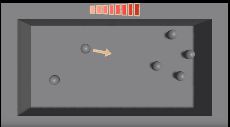
A wild UI appeared!

These couple of weeks have been quite hard compared to the demos of the first two weeks, and the drawing pretty pictures of the third. I’ve been working on making the UI drawings actually control movement and Unity’s been making it.. challenging.
The root of the problems stem from I’ve never tried to build a UI in unity before. All of my previous work with it has been playing around physics, or AI, or tying together movement to form a basic game, but all of those have used the most basic forms of on-screen buttons, and mouse / keyboard / controller combinations.
To make something that works well with both touch and mouse control, and contains multiple steps (so you need to know if where you’ve touched is over a UI element or not) can be quite complex with very little documentation around. I may add a future UI blog post to cover these issues, but suffice to say it’s not as simple as it feels like it should be. This doesn’t even take into account the annoying animator object that seems to always take a single frame to change, which lead to every annoying flashes.
Continuing my UI journey, I’ve recreated the UI code about 4 times in the past 2 weeks. I was trying to write it as if it was a game jam, but was never happy that it would then be extensible enough without major repetition (and possible repeated bugs), and possible repeated bugs…
The main issue here was that to move with my new interface, you first have to set a direction, and then set a power for that direction. The UI needs to smoothly transition between these, while remembering your state. The aim is to allow player skills and spells in to this that will use the same UI, so I’d end up just copying 95% of the code whenever a new one was added. Instead, I’ve actually used a simple State Machine that can decide what UI elements need to be displayed when, and what data’s required from each.
The end result of this can all be seen in the video below. There are two player characters who can moved around the, now landscape, world (I couldn’t get a portrait game to work well with the amount of data I wanted to show). These players can be selected and have a direction chosen for them. With a valid direction, the power bar appears at the top of the screen to let you pick the power (and drag on and off the power bar). If you choose a power > 0 then your character will move, otherwise it’ll wait for either a power setting or a new character selection.
The next focus is going to be on finishing getting the rest of UI that’s already been designed into Unity. Most important of these is probably the health bars so we can start attacking and killing guys.